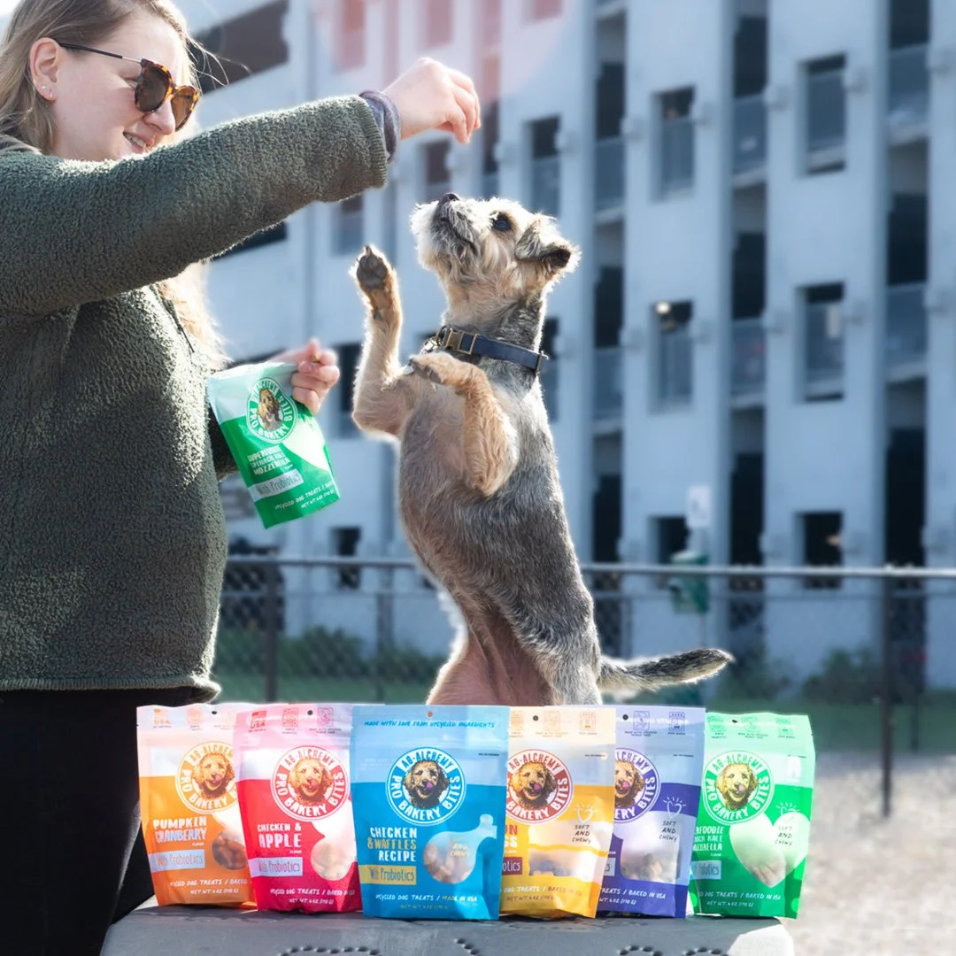
Ag-Alchemy Pro Bakery Bites™ Line
Brand Refresh, Packaging, Illustration
A local bread manufacturer transforms their imperfect loaves into upcycled dog treats. The problem? They lacked a cohesive brand and message necessary to get their treats noticed.
Their brand combines the rainbow of colors used on their packaging with hand-drawn text and illustrations to give it a dog-like personality. I worked with an illustrator to create their main brand illustrations, and carried on the style onto all future materials.
Most recently, they launched dog treat protein bars, and I pitched three flavor names and wrap concepts. With the added protein in the bars, I wanted the names and packaging to reflect the active lifestyle of dogs who may enjoy them. The design for the bars uses the bright colors and handwritten type from their current packaging, but stands apart with eye-catching illustrations that help create energy and movement. The names themselves contain active words like “kickin’” and “power.”
General Brand Materials
Designed as part of the Iridian Team
Role: Design and art direction


